Graphically in the space I want to use an abstract image inspired by trees in the forest. This can be used on all surfaces and also be a way finding device. I want it to made of cork or similar materials to create a change in texture. Tina suggested that it could become more 3D and possibly used for spaces people can sit on/crawl into. These images also show what I'm thinking for a color scheme. I want soft and neutral greens, browns, and blues/violets.
When it comes to materials and colors he wants to warm the space up and make it more comfortable. Making it a more homelike environment is important in his concept idea, and the CMU walls that are currently in the space do not help with that kind of aesthetic. He wants to incorporate more natural light into the space by having larger windows, but I’m not sure installing new windows is feasible for the hospital. But I think it’s important at this point to “dream big” and then bring our ideas to a smaller scale.
Shape and form is something I’m very interested in learning about with Greg’s project. So far he has the idea of introducing curvilinear forms that contour to the body, presumably for furniture pieces. I’d like to see if these forms are going to be used for walls, floors, or ceilings.
Brittany has chosen “Growth” as a concept for her design of Central Regional Hospital. She’s done a great job of relating this concept to the needs of the users of this space. The children and adolescents of the space have possibly been stunted in their psychological health and they need to push out of this place and move on.
So far she plans to show growth through forms and shapes that expand and contract. I would like to see more exploration of colors and how that will fit in with the concept and the needs of the patients. More sketches of the space and how it’s divided up would help me understand her ideas better. The bubble diagram helps me get a better understanding of how the spaces relate to each other, but an image with the plan and proposed designs would help even more.
I really like the fact that Brittany has thought about what actual activities the kids will be doing in the spaces. She knows that they need stimulation so that staff can understand how the kids are doing. It would be great if she can discover those activities and cater the design to them. She has also considered the users with her custom idea for the reception desk. It is transparent to allow clear visualization but it also has different heights to accommodate small children.


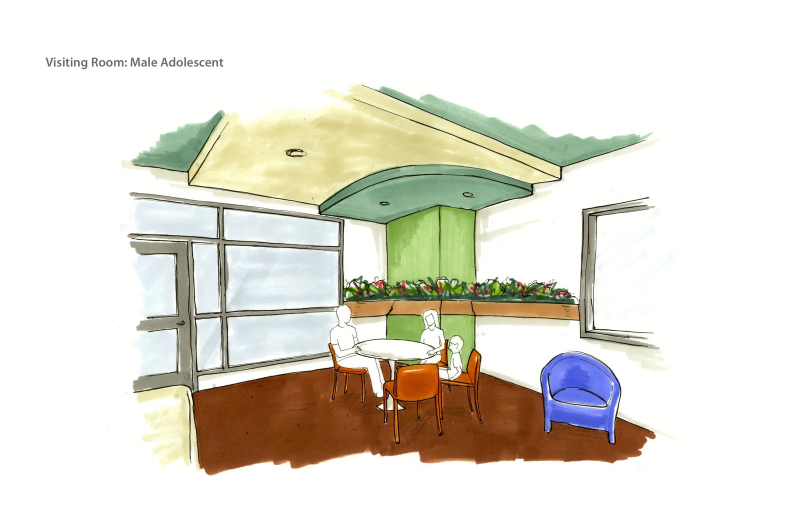
 Sketch and diagram done for this study.