Tuesday, April 27, 2010

happy

The last project for studio this semester is all about happiness. To start it off, we were told to find a design that makes us happy, and something we would be happy to re-design. I found the first image from Kendall Wilkinson design and I am in love with this view of the room. immediately feel happy when looking at it. Besides the pops of fresh color, I love that it blends clean and modern style with traditional elements, like the molding on the walls.

It was hard to find a space that I would be happy to redesign because there are a lot that come up. I chose this room because it has great bones to start with: cool windows, a fireplace, and even the same molding detail on the walls as the first room. There are a lot of things that could be changed to make it a happy space.


Friday, April 23, 2010

IAR 202: Final presentation


We presented all of the work we've done this semester, from the makeshift shelters to phase 3 of Unity Village. I'm so proud of the work this studio has done and I'm happy I got to be a part of it.

Thursday, April 22, 2010

Tuesday, April 20, 2010

Final Perspectives


These are the final perspectives for the phase three project. I had time to experiment with a more loose rendering style and love how they turned out.


Friday, April 16, 2010

Phase 3 programming

Inspiration images: phase 3


Here are some images I've found that express the ideas that I want in Jamel and Grants apartment. The first thing you see when you walk into the space is the living area with huge windows that let in a lot of light. The bright and open space invites you into the environment with streamlined and rectilinear elements. There is also a lot of wood added for warmth, which helps the space transition into the more closed-in parts of the apartment. I found this website helpful for thinking about open spaces.


process: phase 3: perspective

I did this perspective quickly because I was getting frustrated with my sketch-up. It is hard for me to visualize things in sketch-up so I decided to print out what I had and do a practice rendering. I was experiencing with materials and colors to find out what works and what doesn't. I'm not quite done with my design and sketch-up but doing this helped me a lot with my process and confidence in the design.

Process: phase 3: color

I did this quick process sketch to figure out how the color on the walls will work. My concept is about bright and open spaces transitioning into dark and intimate places, so I want the walls to reinforce this idea. I'm also trying to decide what colors to use and tried out green in this example. I am leaning towards using red in the entertaining spaces and blue in the private spaces. I was also playing with ideas of lighting and where fixtures will be located.

Tuesday, April 13, 2010

Designer Strengths: Carlos Smith

I decided to write about Carlos' design strengths because he always has the most unique vision of everyone in the class. He doesn't think about architecture and design in a typical way. He uses his imagination to come up with new forms and shapes to incorporate in the design and doesn't limit himself on what design can be. I would like to learn from this to come up with different shapes that really appeal to the users of the space. His renderings are always great and draw you into the space, sparking your imagination. His scale figures interact with the space making it seem real. The drawings are dynamic and engaging which only makes the design stronger.

Monday, April 12, 2010

Process: Models

These are sketch models that I created for the apartment.

Built-In Desk and bed:


Built-In couch and dining seating:


Concept: Evolved


For the new residential spaces, we are using our same concept as before. However, we need to evolve the concept and make sure it fits the space and the users.

Tracey and I had the concept of openness and the flow of light through the space. All of the spaces were open to each other allowing natural light to reach places it otherwise wouldn't. We used white to reflect light with pops of color to make the space lively. The shapes and forms in the space were rectilinear and modern to appeal to a broad range of people.

Now the space has changed to a residential unit shared by two people. There are open and bright spaces that are for "public" use, but there are also areas that are private and intimate. These spaces will be darker with the use of color and materials, creating an environment to relax. Attention will be paid to how the open spaces transition to the enclosed spaces.

Standards

  • Walls/floors/ceilings should be covered with materials with a 30 minute fire rating (eg. drywall); or materials with a 15 minute fire rating and interconnected smoke alarms, throughout all dwellings in the house
  • Walkway width: 3 ft
Kitchen:

  • countertop depth: 2ft
  • length between countertop and upper cabinets: 18"
  • upper cabinet depth: 12"
  • landing space next to refrigerator and sink: 18"

Apartment Area with two bedrooms:

  • 240 sq ft each room
  • 100 sq ft kitchen
Width of space:

  • Living, Dining: 12 ft

Sunday, April 11, 2010

Strengths as a designer

My strengths as a designer have to do with the fact that I truly care about the users of the space. I put myself in the position of the clients and what they need or want. The function of the space is very important and I try to not insert ideas just because they look good. I make sure to properly research them, especially if it’s a user I don’t know a lot about. This allows me to design spaces that they appreciate and that work for them. Having drawing and rendering skills is very important to me as well. This allows me to quickly get my initial ideas out, develop them, and finally create the designed space in a visual form. I find hand renderings to be more appealing and sparking the imagination and emotions for the people looking at them. Lastly, I work extremely hard to make sure I am putting my best work out there. This has developed more as time has gone on. I will sacrifice sleep or fun in order to get my work done. It is important to me because if I’m not putting my best work out there I will regret it.

Saturday, April 10, 2010

User Needs: Grant and Jamel


College students:

  • Quiet space to study-Soundproofing
  • Space to entertain friends for poker/playing video games/watching sports
  • Entertainment center for TV/game consoles/DVDs/music
  • Functional but small kitchen because they don't cook much (mostly use refrigerator and microwave)
  • Storage space for sports and computer equipment
  • Storage for books
  • Space that is used for fun but also space to relax
  • Quality lighting for doing school work

Friday, April 9, 2010

process: phase 3

Here are some views of the sketch-up that i've created so far. I've got the walls up and the general placement of furniture and units. Next I need to further the design of the couch, kitchen, beds, and wall storage units.

Next we will be making sketch models of different elements of the space, due Monday.

process: phase 3

These are the initial sketches of the space from my sketchbook. I'm focusing on bringing in the previous concept of light, openness, and geometric shapes. I really want to create a custom couch/dining seating in the living room space. One side will be for watching the TV and playing video games, the other side will be seating for the dining table. The dining table is important because it will be used for holding poker nights two times a week.


Thursday, April 8, 2010

unity Village: Phase 3

For the final phase of the project, we will each be designing a residential unit for a given client. My clients are two male college students who share an apartment. They don't cook, like having their friends over, hold poker nights, play video games, and watch sports. They're pretty much the exact opposite of me, which makes it a fun challenge to design for them. I plan on evolving my previous concept to fit the new space, which includes a curved entrance. I will keep using clean lines, geometric shapes, taking advantage of natural light, and pops of color. Here are some images of inspiration I've found so far:


This is an inspiring images just because it mixes the idea of fun and functionality. It is something unexpected and youthful, both important ideas for my design.

I love the idea of incorporating wood on the walls. I might do this instead of having wood on the floor and ceiling. This makes the bed a huge focal point and it even has rectangular cut-out.


I plan on integrating some of the seating in the living/dining area.


Friday, April 2, 2010

Neighborhood B reviews


Ground floor

I loved the overall color scheme of this design and the curved shapes, which weren’t overdone. I wish they had worked to make the renderings lighter because the space seemed dark, which I’m sure was not their intention. The concept didn’t come across as very strong to me. There could have been more elements representing expansion and contraction. The ideas of the concept could have been embedded in the presentation to make it more understandable. Overall the space seems like it would be a very positive environment.

1st floor

This space had a lot of character and they did a great job of adding entourage into the space. Again like the other groups that used podium, the renderings would have benefited by being a bit lighter. I appreciate the idea of the concept of blending the old and the new, which would appeal to the groups living here. However it could have used more development. I wish the vintage furniture and the modern design elements had some more commonalities. I think the mix of textures and the colors are also warm and inviting.

2nd floor

The concept of wind and nature came across very well in the floor plan and perspectives in this project. They did a great job with filling their perspectives with people, making it very community friendly. Although I like the subtle and natural colors, I think the space could benefit from something a bit more dynamic going on. The floor plan is very interesting to look at, but you don’t necessarily see the same shape and movement in the perspectives.


Our group:

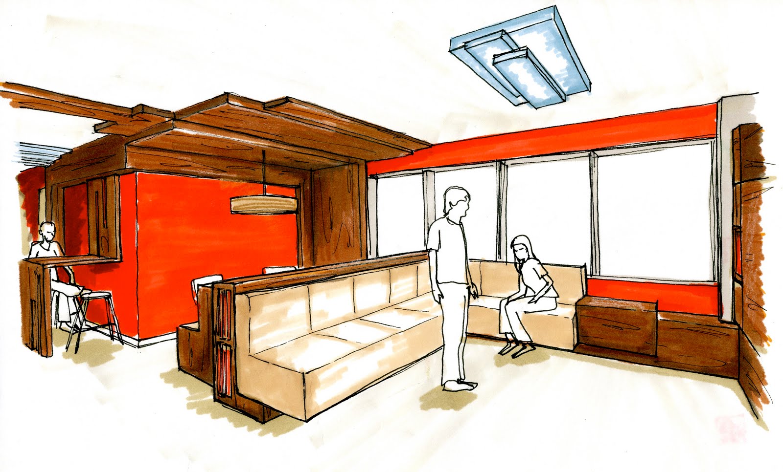
I am very pleased with how our space turned out. It looks like it would be a very happy space that would lift your mood if you were there. I wish we had worked more on making the colors less bright. They could have been closer to the colors in our inspiration images, which were less primary. Our space was very unique, most of the other groups had curved elements and no one had an abundance of white. Another thing we could work on is making the space more appealing to senior citizens, which may be turned off by the modern lines and shapes. We definitely considered how to make the space work for them functionally, but not necessarily if they would like how it looked. The only complaint I have about our process is that we didn’t incorporate enough time to work on the courtyard area, which we wanted to integrate into our design.